This article is a guest post by Ruchi Goel of zipBoard.
The ecommerce industry holds a considerable share of the B2C marketspace. Citing data from eMarketer, RetailTechNews reports that "retail e-commerce sales worldwide will reach USD$2.842tn (£2.035tn) in 2018, increasing 23.3% since 2017.” But despite all this growth, many companies struggle to get their online stores off the ground. The reason is a lack of ecommerce user experience optimization.

For customers, what matters the most is the experience they have with you. And website design isn’t the only thing that comprises the ecommerce user experience. All of the following play a role:
- Discoverability platforms
- Website UI
- Website load time
- Copy
- Checkout workflow
- Familiar design patterns
- Image quality
- Navigation
- Sorting and filtering options
- Payment options
- Delivery time
- Product quality
- Return/replace workflow ease
- Grievances redressal
Why Is User Experience So Important?
User experience has a direct impact on:
- Number of visitors
- Conversions
- Profits
- Growth
So, to harness the potential of the ecommerce world, you need to improve your users' experience.
Practical Tips for Ecommerce User Experience Optimization

Improve Website Usability with Early User Feedback
Usability issues need to be fixed during the development phase. Once users have the impression your site is unusable, the chances of them returning are minimal. Feedback from end users gives you real insights into what you need to improve.
Focus on User Goals to Learn Why They Are Visiting Your E-store
For this, you need to define user personas during the planning phase. Then, you need to ensure you are serving the interests of each category of your target audience. It helps to optimize the experience of all your store users.
For example, cater to different types of shoppers. Some visitors will have already done their research and know exactly what they need to buy. They are looking for a specific product and wish to find it easily. Others may be looking for a better deal and on the hunt for discounts.
Identify User Dropout Points
Using analytics tools, you can observe user behavior. Then you can identify the areas where you need to improve. Directly launching the improvement may add to your costs, so test the potential solutions first and then set the best one in place.
As an example, Optimizely’s case study of Lifeproof shows how a simple text change made their CTA more effective.
Improve Copy
Provide users with enough information to make buying decisions right away. Sharing genuine buyer experiences will fill users with the confidence needed to proceed. Also, the text should be readable across all devices (desktop, tablet, mobile, etc.).
Remove Unnecessary Elements

Make users focus on what you have for them. For FSAstore, removing sub-categories from the homepage worked great.
Use Good Search Algorithms
Help users locate what they are looking for. You can use AI and machine learning algorithms to watch user behavior. This helps you personalize the user experience.
“AI can help boost business for e-commerce brands by automatically analyzing customer data, segmenting personas based on behaviors, as well as making informed decisions about what offers optimize ROI.” —Sarosha Imtiaz, co-founder of AIVA Labs
Provide Users More Ways to Discover You
Investing all your resources into one channel limits your brand’s visibility. The marketplace giants like Amazon, eBay, etc. have huge customer bases. Why not use them to communicate with the maximum number of potential buyers?
Selling on Amazon and eBay is easy. But selling on multiple channels will be fruitful only if you handle the users from all of them effectively. For this, you need to manage your inventory and customer service well. That can be accomplished painlessly with multi-channel software.
Watch Emerging Ecommerce Trends Vigilantly

New trends that make online shopping easier should always command your attention.
- Mobile devices are responsible for about a quarter of ecommerce spending. You cannot afford to ignore that hefty chunk of users on mobile. Having a subpar user experience for mobile users will cost you greatly.
- Voice compatibility can be seen as the next substantial move to enhance the ecommerce user experience. In the words of ecommerce specialist Melvin Simpson, "Suddenly Alexa comes on the scene and you’re designing a conversational interface.”
Resources
Resources for Optimizing Your Ecommerce Website’s Look and Feel
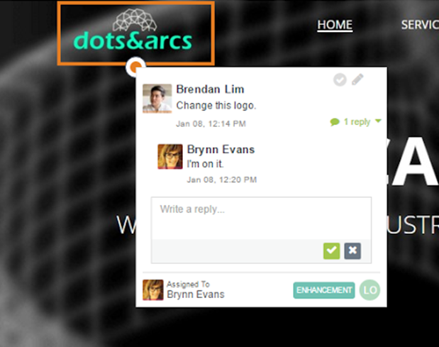
zipBoard is a visual feedback tool. It allows your clients and users to annotate over your website to provide feedback. It best suits the needs of collecting UI/design/copy feedback during website development/redesign.
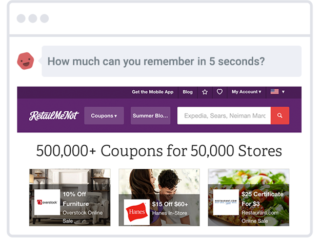
UsabilityHub is a remote user testing tool. Here random users test your website for ease of navigation, A/B testing of different design elements, etc.
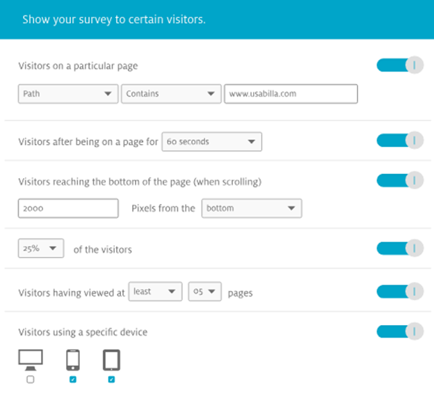
Usabilla is a user feedback tool. It gets you live feedback from sincere users. You can also create and manage feedback forms and campaigns.
Resources for Optimizing Marketplace Selling
ChannelReply is a marketplace helpdesk solution. It integrates eBay, Amazon and Walmart customer service messages with the helpdesk of your choice.
Kyozou is an inventory and multi-channel listing management tool. It also provides design, webstore setup, and sales services.
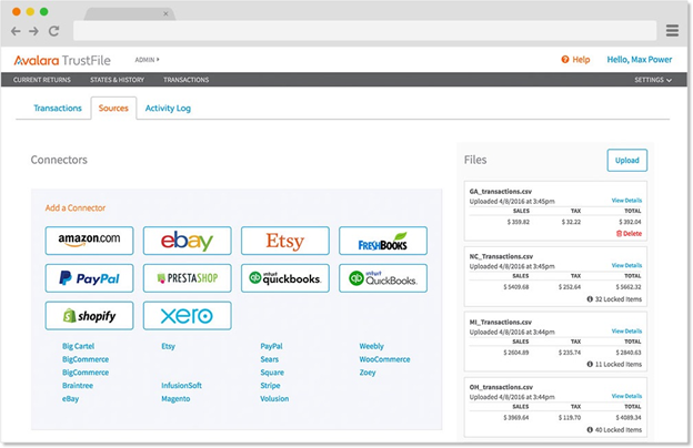
Avalara TrustFile is your tax assistant. It automates sales tax preparation and filing for ecommerce merchants. It can handle sales data from several major marketplaces.
Conclusion
Users rule the market and user experience rules user decisions. Therefore, user experience lays down the foundation for customer conversion, retention and loyalty. So, don’t cause your users to think twice. Make things simple for them. That’s all you need to do to optimize the ecommerce user experience.
“Think like a wise man, but communicate in the language of the people.” —William Butler Yeats
About the Author
Ruchi Goel is a digital marketer with an interest in user-focused web development and design. To read more of her articles, find her on Medium.


